Tutorial: Visualization#
This tutorial demonstrates how to visualize IWFM model data using pyiwfm’s visualization tools, including GIS export, VTK 3D export, and matplotlib plotting.
Learning Objectives#
By the end of this tutorial, you will be able to:
Export model meshes to GIS formats (GeoPackage, Shapefile, GeoJSON)
Create 2D and 3D VTK files for ParaView
Plot meshes and scalar fields with matplotlib
Create publication-quality figures
Setup#
First, let’s create a sample model to visualize:
import numpy as np
from pyiwfm.core.mesh import AppGrid, Node, Element
from pyiwfm.core.stratigraphy import Stratigraphy

# Create a 5x5 grid of nodes
nodes = {}
node_id = 1
for j in range(5):
    for i in range(5):
        is_boundary = (i == 0 or i == 4 or j == 0 or j == 4)
        nodes[node_id] = Node(
            id=node_id,
            x=float(i * 250),
            y=float(j * 250),
            is_boundary=is_boundary,
        )
        node_id += 1

# Create 16 quadrilateral elements
elements = {}
elem_id = 1
for j in range(4):
    for i in range(4):
        n1 = j * 5 + i + 1
        n2 = n1 + 1
        n3 = n2 + 5
        n4 = n1 + 5
        subregion = 1 if i < 2 else 2
        elements[elem_id] = Element(
            id=elem_id,
            vertices=(n1, n2, n3, n4),
            subregion=subregion,
        )
        elem_id += 1

grid = AppGrid(nodes=nodes, elements=elements)
grid.compute_connectivity()

# Create stratigraphy (2 layers)
n_nodes = grid.n_nodes
gs_elev = np.full(n_nodes, 100.0)
top_elev = np.column_stack([np.full(n_nodes, 100.0), np.full(n_nodes, 50.0)])
bottom_elev = np.column_stack([np.full(n_nodes, 50.0), np.full(n_nodes, 0.0)])
active_node = np.ones((n_nodes, 2), dtype=bool)

stratigraphy = Stratigraphy(
    n_layers=2, n_nodes=n_nodes,
    gs_elev=gs_elev, top_elev=top_elev, bottom_elev=bottom_elev,
    active_node=active_node,
)

# Create sample head data
x = np.array([grid.nodes[i].x for i in sorted(grid.nodes.keys())])
y = np.array([grid.nodes[i].y for i in sorted(grid.nodes.keys())])
head_values = 50 + 20 * np.sin(x / 500) * np.cos(y / 500)

print(f"Created model: {grid.n_nodes} nodes, {grid.n_elements} elements")
Part 1: GIS Export#
Exporting to GeoPackage#
GeoPackage is the recommended format for GIS data - it’s a single file that can contain multiple layers.
from pyiwfm.visualization import GISExporter

# Create exporter with CRS
exporter = GISExporter(
    grid=grid,
    stratigraphy=stratigraphy,
    crs="EPSG:26910",  # NAD83 / UTM zone 10N
)

# Export to GeoPackage with all layers
exporter.export_geopackage(
    "model_output.gpkg",
    include_subregions=True,
    include_boundary=True,
)

print("Exported layers: nodes, elements, subregions, boundary")
Exporting to Shapefiles#
Shapefiles are widely supported but have limitations (10-character field names).
# Export to shapefiles (creates multiple files)
exporter.export_shapefiles("shapefiles/")

# This creates:
# - shapefiles/nodes.shp
# - shapefiles/elements.shp
# - shapefiles/subregions.shp
# - shapefiles/boundary.shp
Exporting to GeoJSON#
GeoJSON is useful for web applications and data exchange.
# Export individual layers as GeoJSON
exporter.export_geojson("nodes.geojson", layer="nodes")
exporter.export_geojson("elements.geojson", layer="elements")
Adding Custom Attributes#
Add simulation results or other data as attributes:
# Create head data as dictionary mapping node_id -> value
head_dict = {
    node_id: float(head_values[i])
    for i, node_id in enumerate(sorted(grid.nodes.keys()))
}

# Get nodes GeoDataFrame with custom attributes
nodes_gdf = exporter.nodes_to_geodataframe(
    attributes={"head_ft": head_dict}
)

# Save to GeoPackage
nodes_gdf.to_file("nodes_with_heads.gpkg", driver="GPKG")
Part 2: VTK Export for ParaView#
VTK files can be opened in ParaView for 3D visualization.
2D Surface Mesh#
from pyiwfm.visualization import VTKExporter

# Create VTK exporter
vtk_exporter = VTKExporter(grid=grid, stratigraphy=stratigraphy)

# Export 2D mesh
vtk_exporter.export_vtu("mesh_2d.vtu", mode="2d")

# Export with scalar data
vtk_exporter.export_vtu(
    "mesh_2d_with_heads.vtu",
    mode="2d",
    node_scalars={"head": head_values},
)
3D Volumetric Mesh#
# Export 3D mesh (hexahedra for quads, wedges for triangles)
vtk_exporter.export_vtu("mesh_3d.vtu", mode="3d")

# Export with scalar data on nodes
vtk_exporter.export_vtu(
    "mesh_3d_with_heads.vtu",
    mode="3d",
    node_scalars={"head": head_values},
)

# Create cell-centered data (one value per element per layer)
n_cells = grid.n_elements * stratigraphy.n_layers
kh_values = np.random.uniform(10, 100, n_cells)

vtk_exporter.export_vtu(
    "mesh_3d_with_kh.vtu",
    mode="3d",
    cell_scalars={"kh": kh_values},
)
Legacy VTK Format#
# Export to legacy VTK format (wider compatibility)
vtk_exporter.export_vtk("mesh_3d.vtk", mode="3d")
Part 3: Matplotlib Plotting#
Create publication-quality 2D figures with matplotlib.
Basic Mesh Plot#
from pyiwfm.visualization.plotting import (
plot_mesh, plot_nodes, plot_elements, plot_scalar_field,
plot_boundary, MeshPlotter,
)
import matplotlib.pyplot as plt
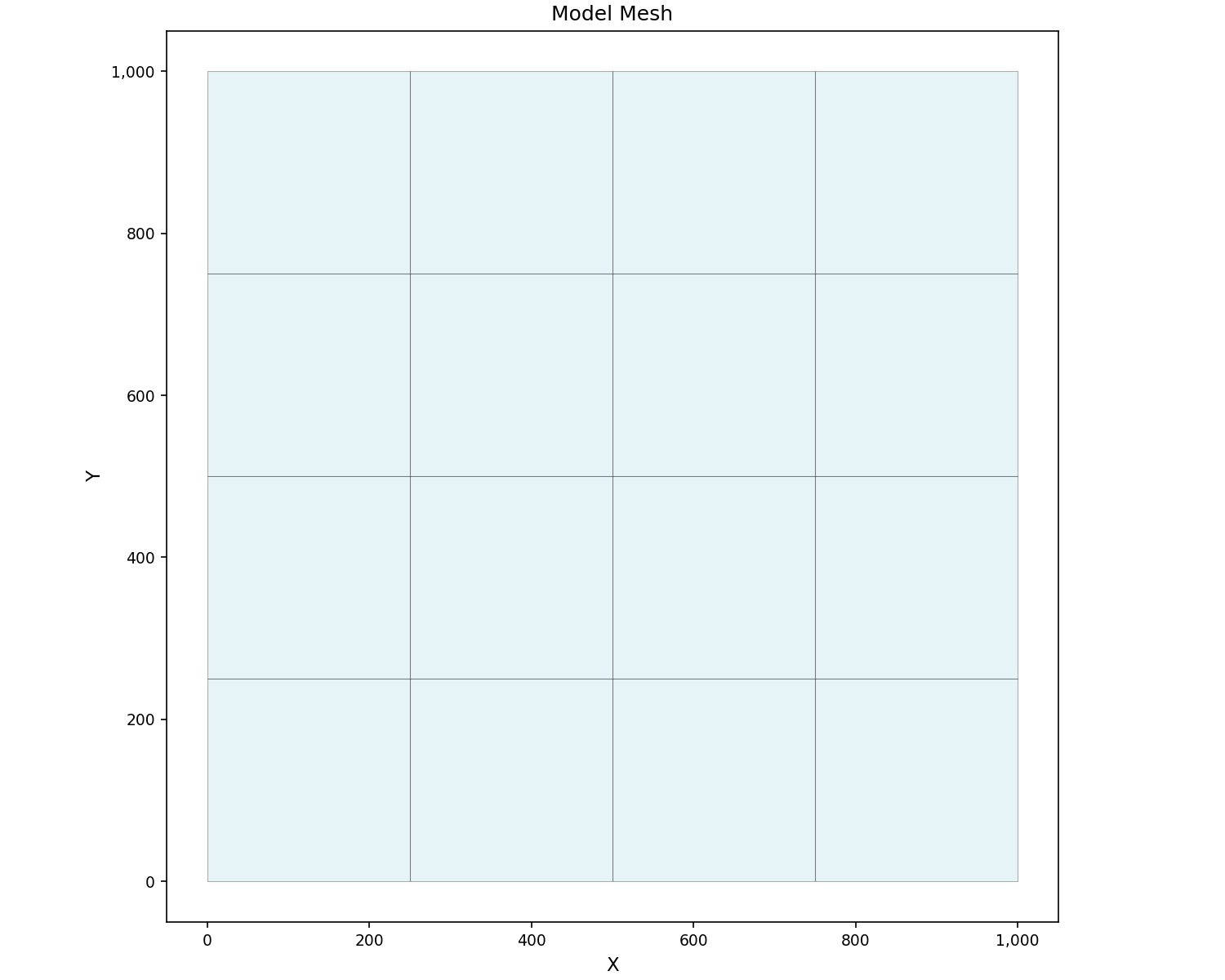
# Simple mesh plot
fig, ax = plot_mesh(grid, show_edges=True, figsize=(10, 8))
ax.set_title("Model Mesh")
plt.show()
Mesh with Labels#
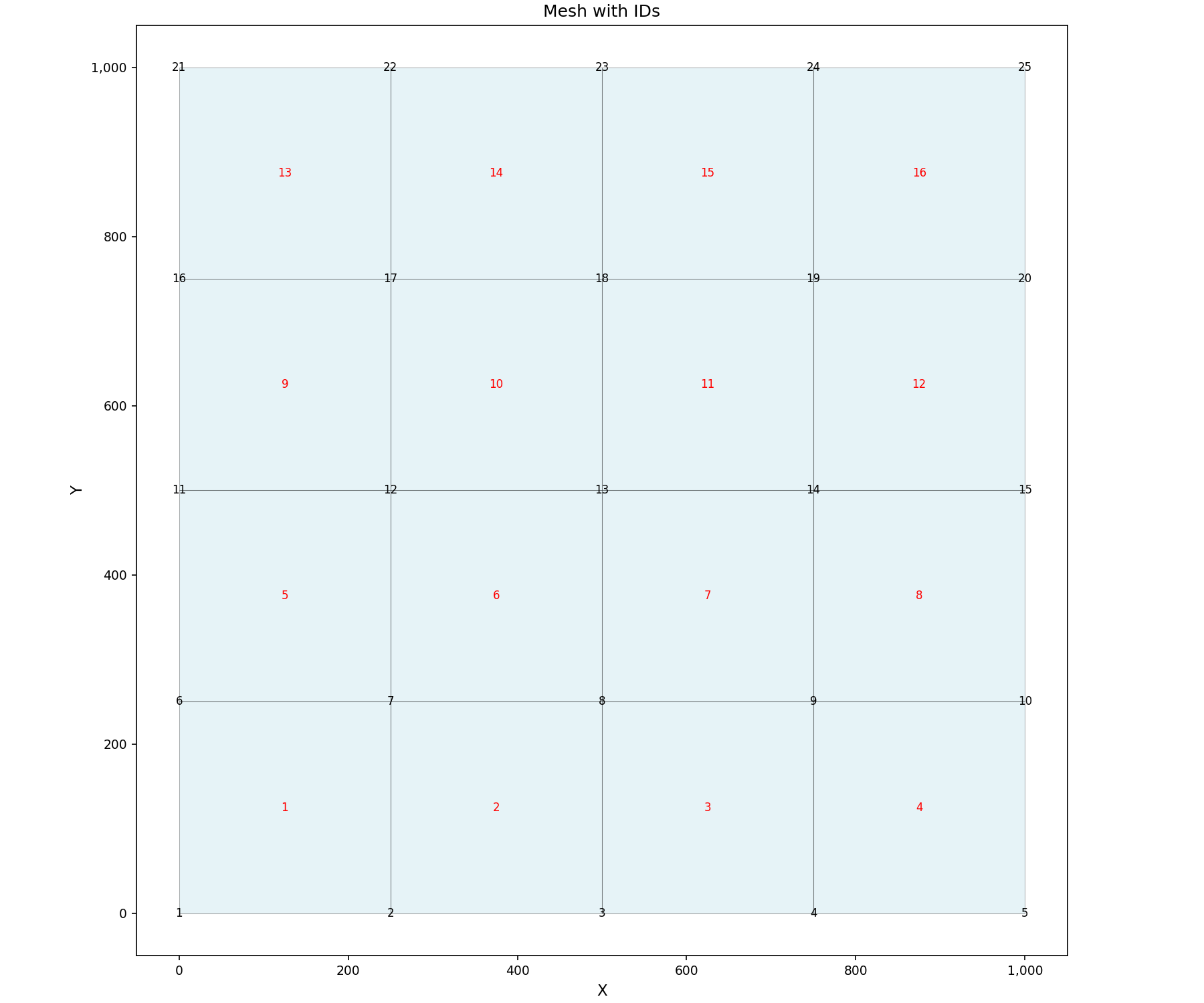
# Mesh with node and element IDs
fig, ax = plot_mesh(
    grid,
    show_edges=True,
    show_node_ids=True,
    show_element_ids=True,
    figsize=(12, 10),
)
ax.set_title("Mesh with IDs")
plt.show()
Colored by Subregion#
# Elements colored by subregion
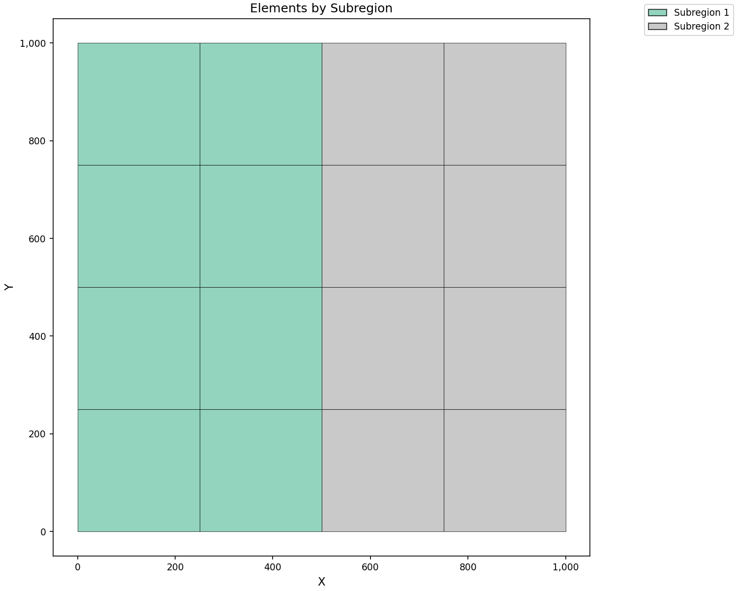
fig, ax = plot_elements(
grid,
color_by="subregion",
cmap="Set2",
show_colorbar=True,
figsize=(10, 8),
)
ax.set_title("Elements by Subregion")
plt.show()
Scalar Field Visualization#
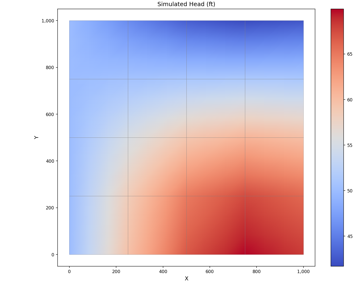
# Contour plot of head values
fig, ax = plot_scalar_field(
    grid,
    head_values,
    field_type="node",
    cmap="coolwarm",
    show_colorbar=True,
    show_mesh=True,
    figsize=(10, 8),
)
ax.set_title("Simulated Head (ft)")
plt.show()
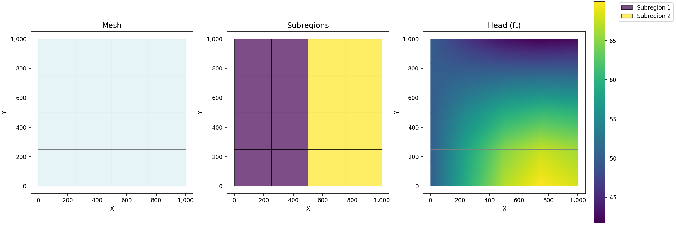
Multiple Plots#
# Create figure with multiple subplots
fig, axes = plt.subplots(1, 3, figsize=(15, 5))

# Plot 1: Mesh
plot_mesh(grid, ax=axes[0], show_edges=True)
axes[0].set_title("Mesh")

# Plot 2: Subregions
plot_elements(grid, ax=axes[1], color_by="subregion")
axes[1].set_title("Subregions")

# Plot 3: Head contours
plot_scalar_field(grid, head_values, ax=axes[2], field_type="node")
axes[2].set_title("Head (ft)")

plt.show()
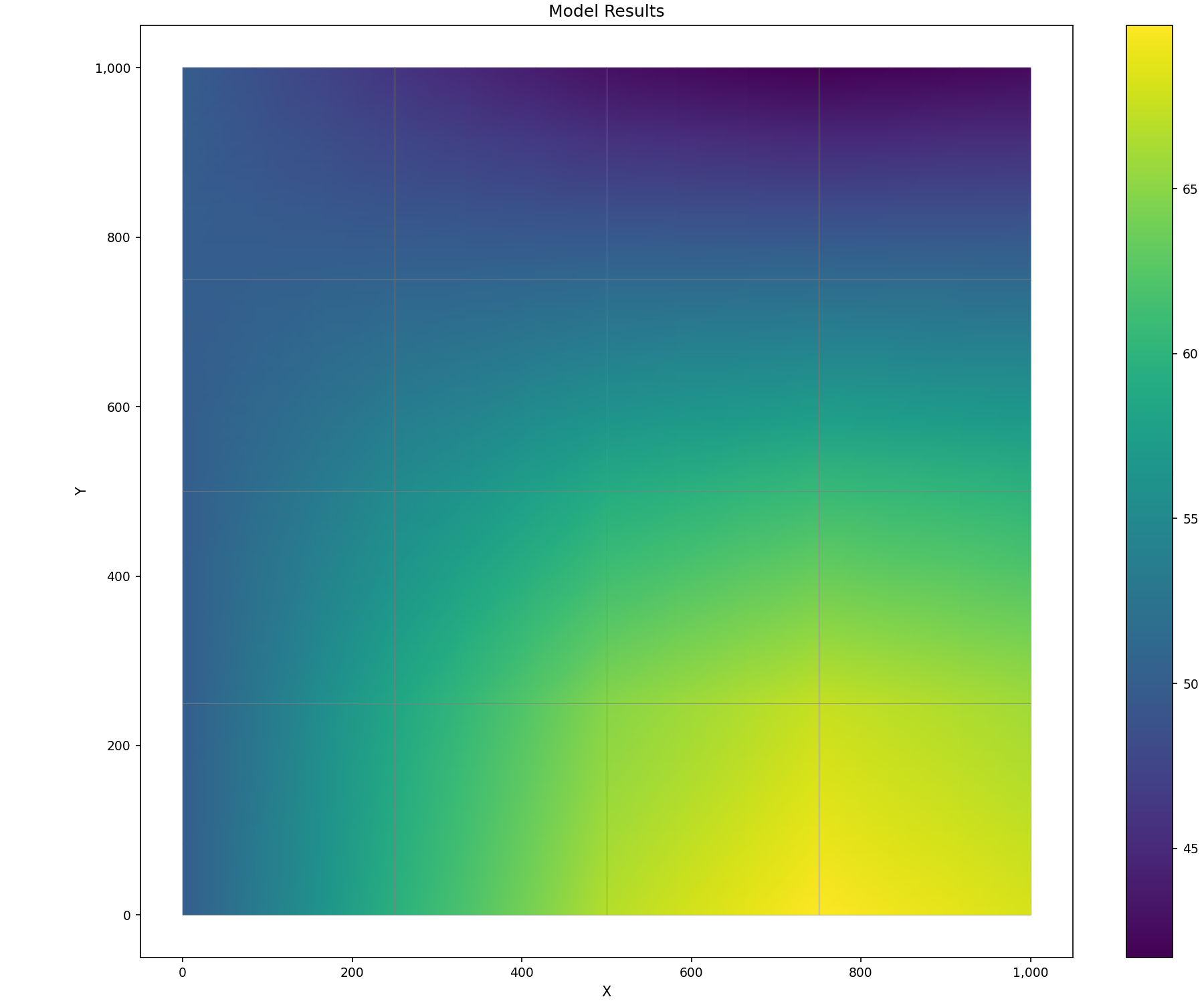
Using MeshPlotter Class#
The MeshPlotter class provides a convenient interface for complex visualizations:
# Create plotter
plotter = MeshPlotter(grid, figsize=(12, 10))

# Create composite plot
fig, ax = plotter.plot_composite(
    show_mesh=True,
    node_values=head_values,
    title="Model Results",
    cmap="viridis",
)
plt.show()
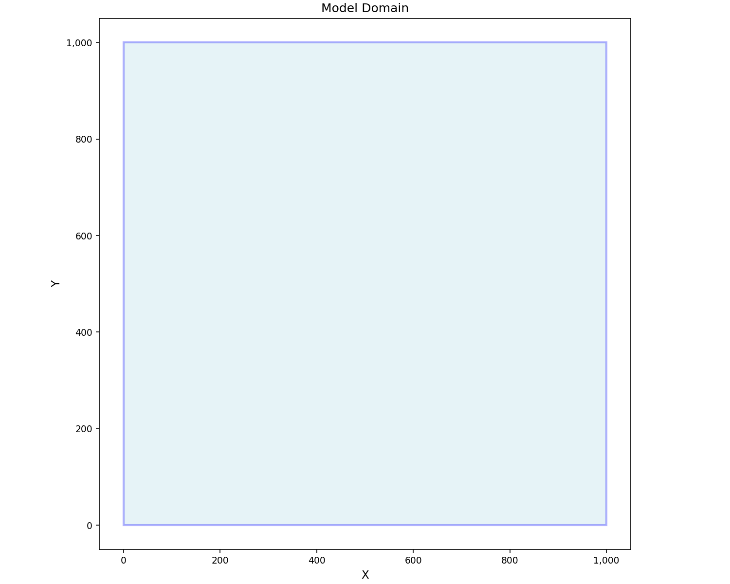
Boundary and Nodes#
# Plot boundary only
fig, ax = plot_boundary(
    grid,
    line_color="blue",
    line_width=2,
    fill=True,
    fill_color="lightblue",
    alpha=0.3,
)
ax.set_title("Model Domain")
plt.show()
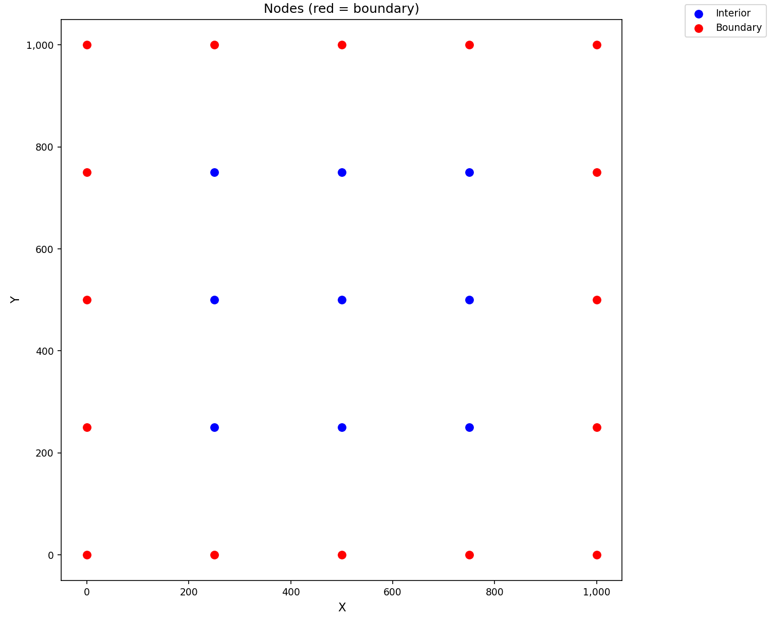
# Plot nodes highlighting boundary
fig, ax = plot_nodes(
    grid,
    highlight_boundary=True,
    color="blue",
    boundary_color="red",
    marker_size=50,
)
ax.set_title("Nodes (red = boundary)")
plt.show()
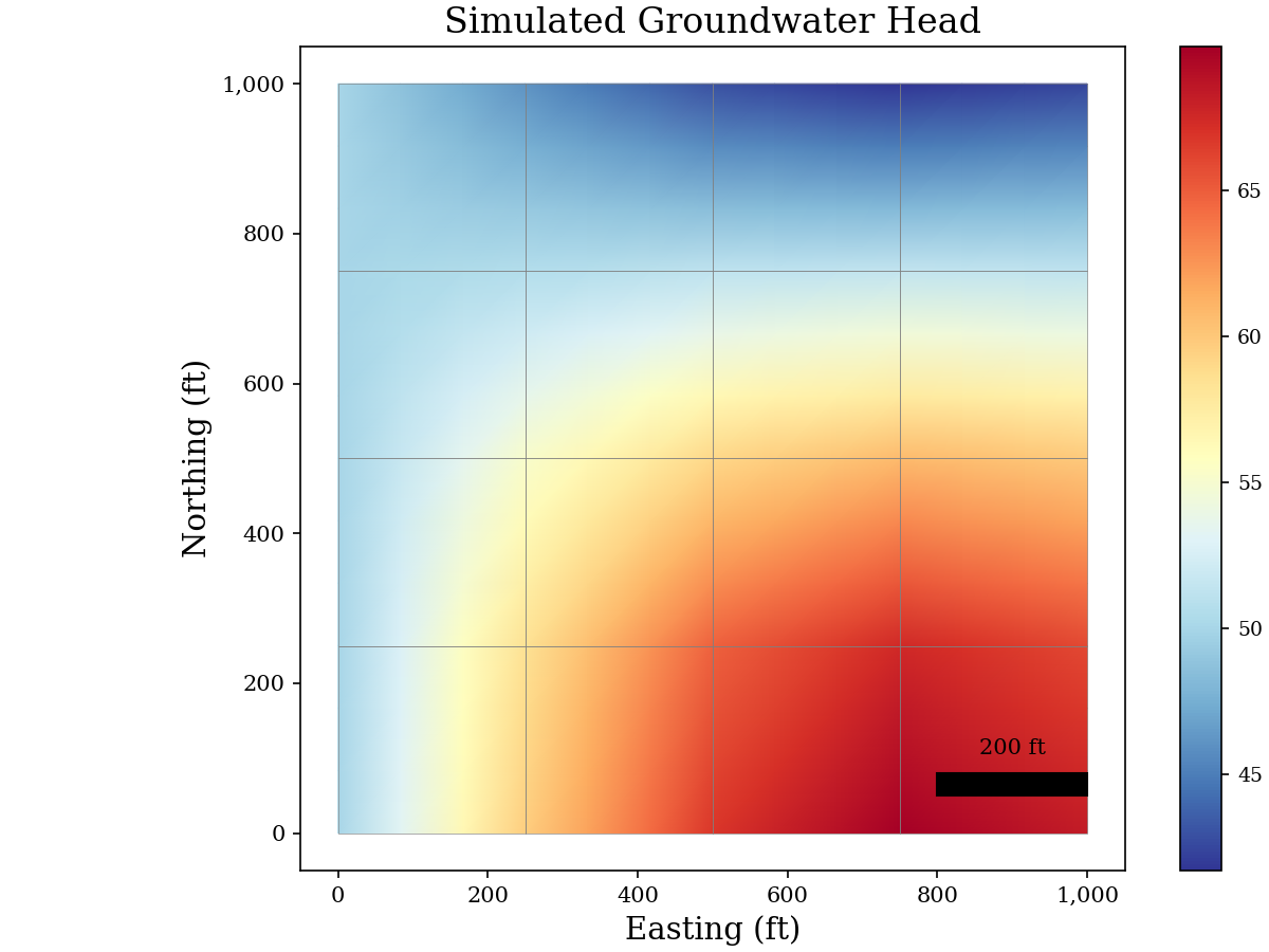
Publication-Quality Figure#
from matplotlib.patches import FancyBboxPatch

# Set publication style
plt.rcParams.update({
    "font.size": 12,
    "font.family": "serif",
    "axes.labelsize": 14,
    "axes.titlesize": 16,
    "xtick.labelsize": 10,
    "ytick.labelsize": 10,
})

fig, ax = plt.subplots(figsize=(8, 6))

# Plot scalar field with custom colorbar
plot_scalar_field(
    grid, head_values,
    field_type="node",
    ax=ax,
    cmap="RdYlBu_r",
    show_mesh=True,
    edge_color="gray",
    edge_width=0.3,
)

ax.set_xlabel("Easting (ft)")
ax.set_ylabel("Northing (ft)")
ax.set_title("Simulated Groundwater Head")

# Add scale bar (example)
scalebar = FancyBboxPatch(
    (800, 50), 200, 30,
    boxstyle="square,pad=0",
    facecolor="black",
)
ax.add_patch(scalebar)
ax.text(900, 100, "200 ft", ha="center", va="bottom", fontsize=10)
plt.show()
Summary#
This tutorial covered:
GIS Export: GeoPackage, Shapefile, and GeoJSON formats
VTK Export: 2D surface and 3D volumetric meshes for ParaView
Matplotlib: Mesh plots, scalar fields, and publication figures
Key classes and functions:
GISExporter- Export to GIS formatsVTKExporter- Export to VTK formatsplot_mesh()- Basic mesh visualizationplot_scalar_field()- Contour/color plots of dataMeshPlotter- Composite visualizations