Water Budget Visualization#
This page demonstrates how to visualize water budget components from IWFM models, including bar charts, pie charts, stacked plots, and water balance diagrams. Each example shows the pyiwfm helper function first, then optionally the raw matplotlib equivalent for customization.
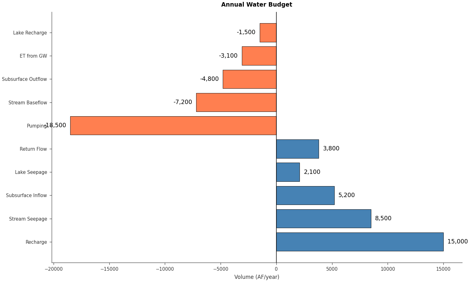
Bar Chart Budget#
Use plot_budget_bar() for a quick budget bar chart:
import matplotlib.pyplot as plt
from pyiwfm.sample_models import create_sample_budget_data
from pyiwfm.visualization.plotting import plot_budget_bar

budget = create_sample_budget_data()

# Flatten inflows and outflows into a single dict
components = {}
for name, val in budget['Inflows'].items():
    components[name] = val
for name, val in budget['Outflows'].items():
    components[name] = val

fig, ax = plot_budget_bar(components, title='Annual Water Budget',
                          orientation='horizontal', units='AF/year')
plt.show()
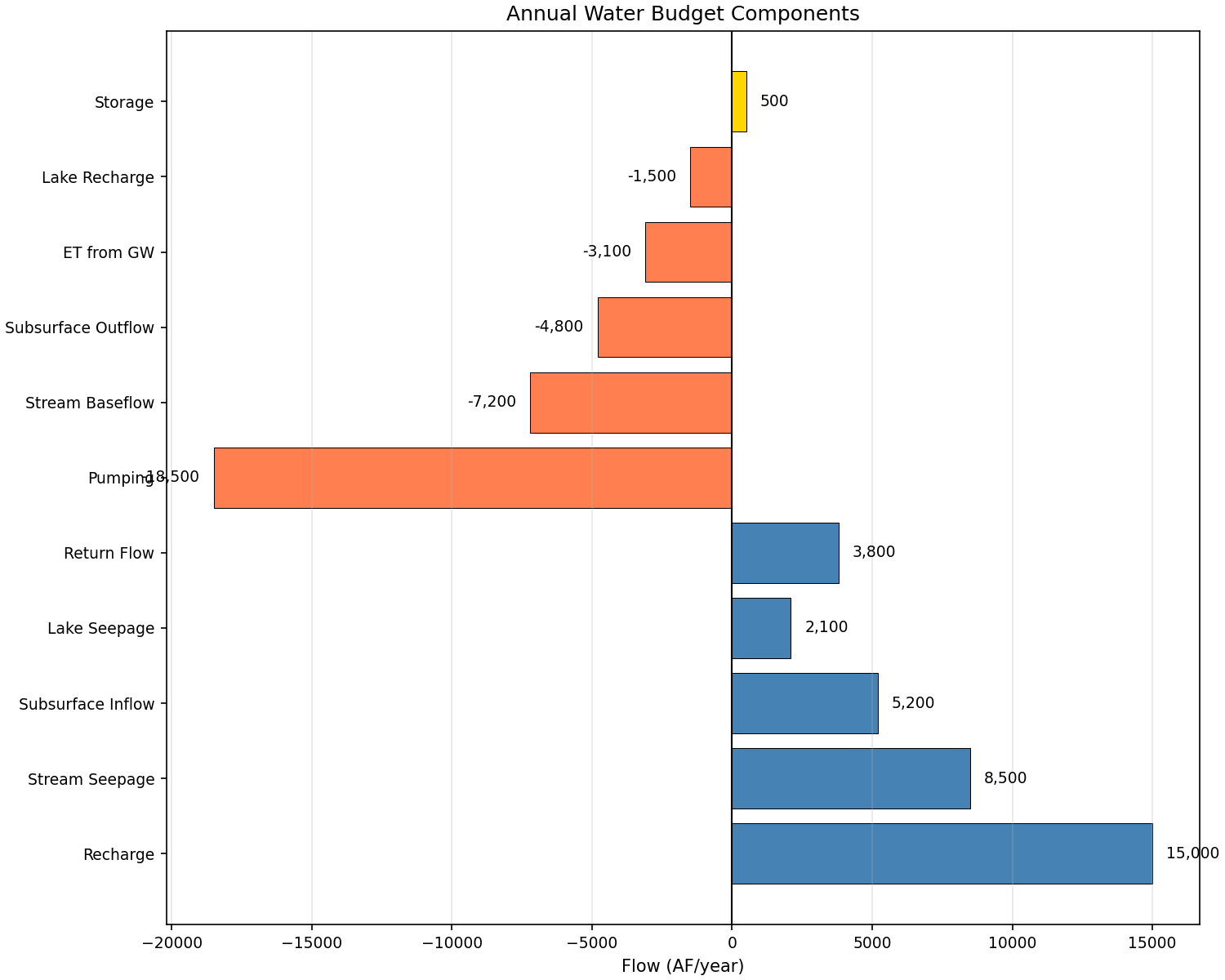
Raw matplotlib alternative for full customization:
import matplotlib.pyplot as plt
import numpy as np
from pyiwfm.sample_models import create_sample_budget_data

budget = create_sample_budget_data()

fig, ax = plt.subplots(figsize=(10, 8))

components = []
values = []
colors = []

for name, val in budget['Inflows'].items():
    components.append(name)
    values.append(val)
    colors.append('steelblue')

for name, val in budget['Outflows'].items():
    components.append(name)
    values.append(val)
    colors.append('coral')

for name, val in budget['Storage Change'].items():
    components.append(name)
    values.append(val)
    colors.append('gold' if val >= 0 else 'orange')

y_pos = np.arange(len(components))
ax.barh(y_pos, values, color=colors, edgecolor='black', linewidth=0.5)
ax.axvline(x=0, color='black', linewidth=1)
ax.set_yticks(y_pos)
ax.set_yticklabels(components)
ax.set_xlabel('Flow (AF/year)')
ax.set_title('Annual Water Budget Components')

for i, (v, c) in enumerate(zip(values, colors)):
    offset = 500 if v >= 0 else -500
    ha = 'left' if v >= 0 else 'right'
    ax.text(v + offset, i, f'{v:,.0f}', va='center', ha=ha, fontsize=9)

ax.grid(True, axis='x', alpha=0.3)
plt.show()
Pie Chart Budget#
Use plot_budget_pie() for budget distributions:
import matplotlib.pyplot as plt
from pyiwfm.sample_models import create_sample_budget_data
from pyiwfm.visualization.plotting import plot_budget_pie

budget = create_sample_budget_data()

# Combine inflows and outflows (make outflows positive for pie chart)
components = {}
for name, val in budget['Inflows'].items():
    components[name] = val
for name, val in budget['Outflows'].items():
    components[name] = abs(val)

fig, ax = plot_budget_pie(components, title='Water Budget Distribution',
                          budget_type='both', units='AF/year')
plt.show()
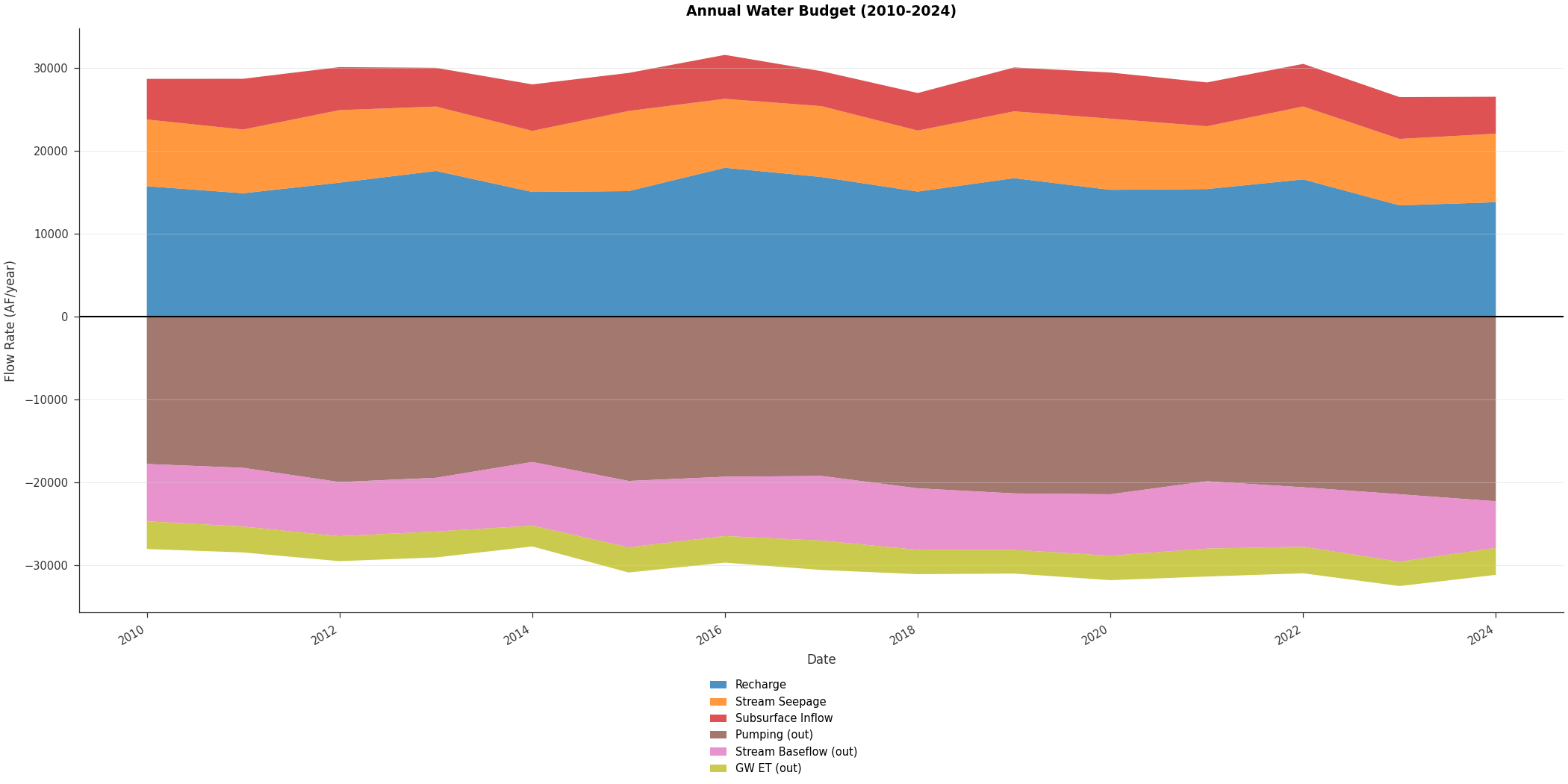
Stacked Budget Over Time#
Use plot_budget_stacked() for time-varying budgets:
import matplotlib.pyplot as plt
import numpy as np
from pyiwfm.visualization.plotting import plot_budget_stacked

np.random.seed(42)
years = np.arange(2010, 2025)
n_years = len(years)
times = np.array([f'{y}-01-01' for y in years], dtype='datetime64')

components = {
    'Recharge': 15000 + np.random.normal(0, 1500, n_years) + np.arange(n_years) * 100,
    'Stream Seepage': 8500 + np.random.normal(0, 800, n_years),
    'Subsurface Inflow': 5200 + np.random.normal(0, 500, n_years),
    'Pumping': -(18500 + np.random.normal(0, 1000, n_years) + np.arange(n_years) * 200),
    'Stream Baseflow': -(7200 + np.random.normal(0, 600, n_years)),
    'GW ET': -(3100 + np.random.normal(0, 300, n_years)),
}

fig, ax = plot_budget_stacked(times, components,
                               title='Annual Water Budget (2010-2024)',
                               units='AF/year')
plt.show()
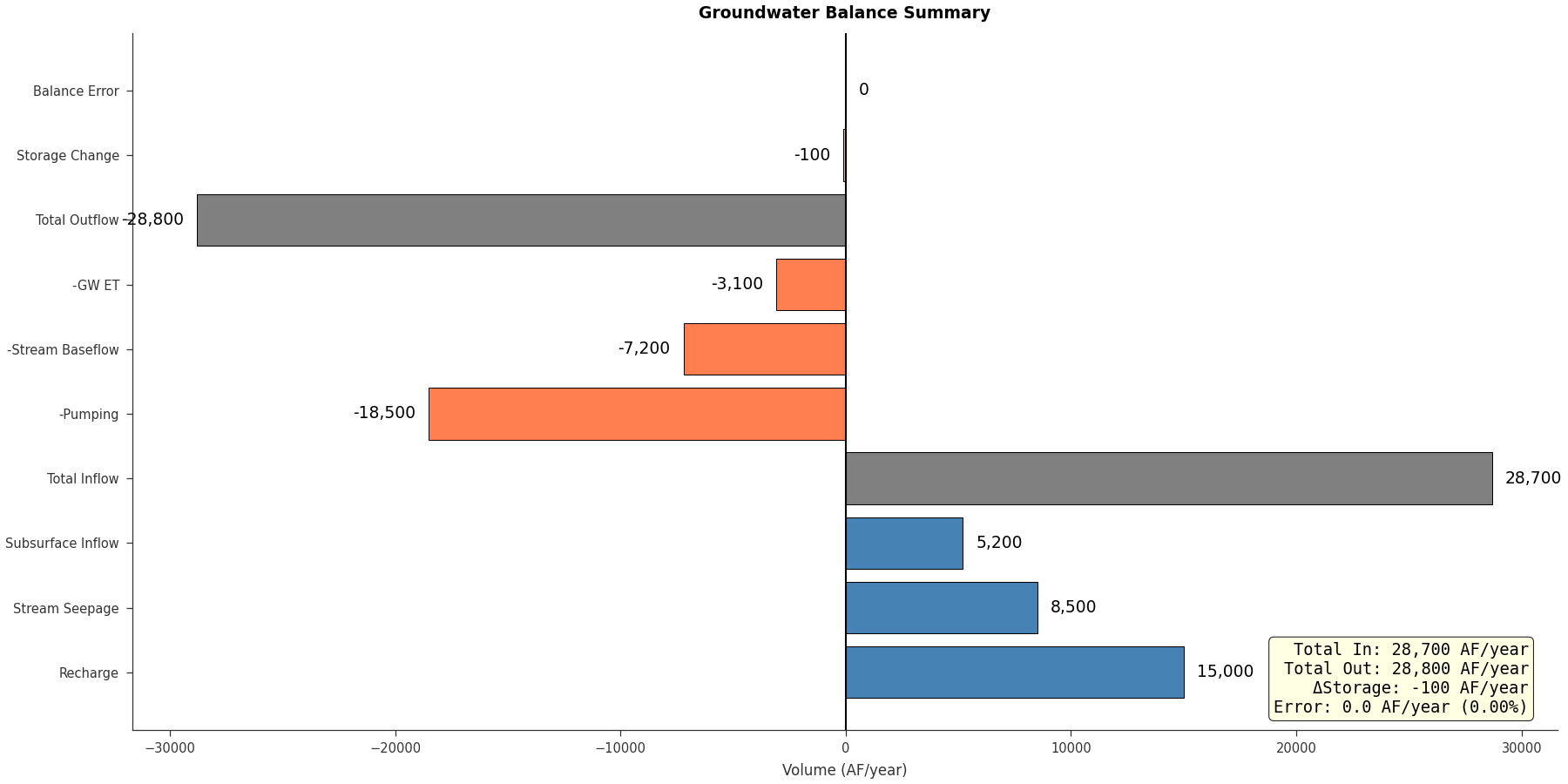
Water Balance Diagram#
Use plot_water_balance() for a summary chart:
import matplotlib.pyplot as plt
from pyiwfm.visualization.plotting import plot_water_balance

inflows = {
    'Recharge': 15000,
    'Stream Seepage': 8500,
    'Subsurface Inflow': 5200,
}
outflows = {
    'Pumping': 18500,
    'Stream Baseflow': 7200,
    'GW ET': 3100,
}

fig, ax = plot_water_balance(inflows, outflows, storage_change=-100,
                              title='Groundwater Balance Summary',
                              units='AF/year')
plt.show()
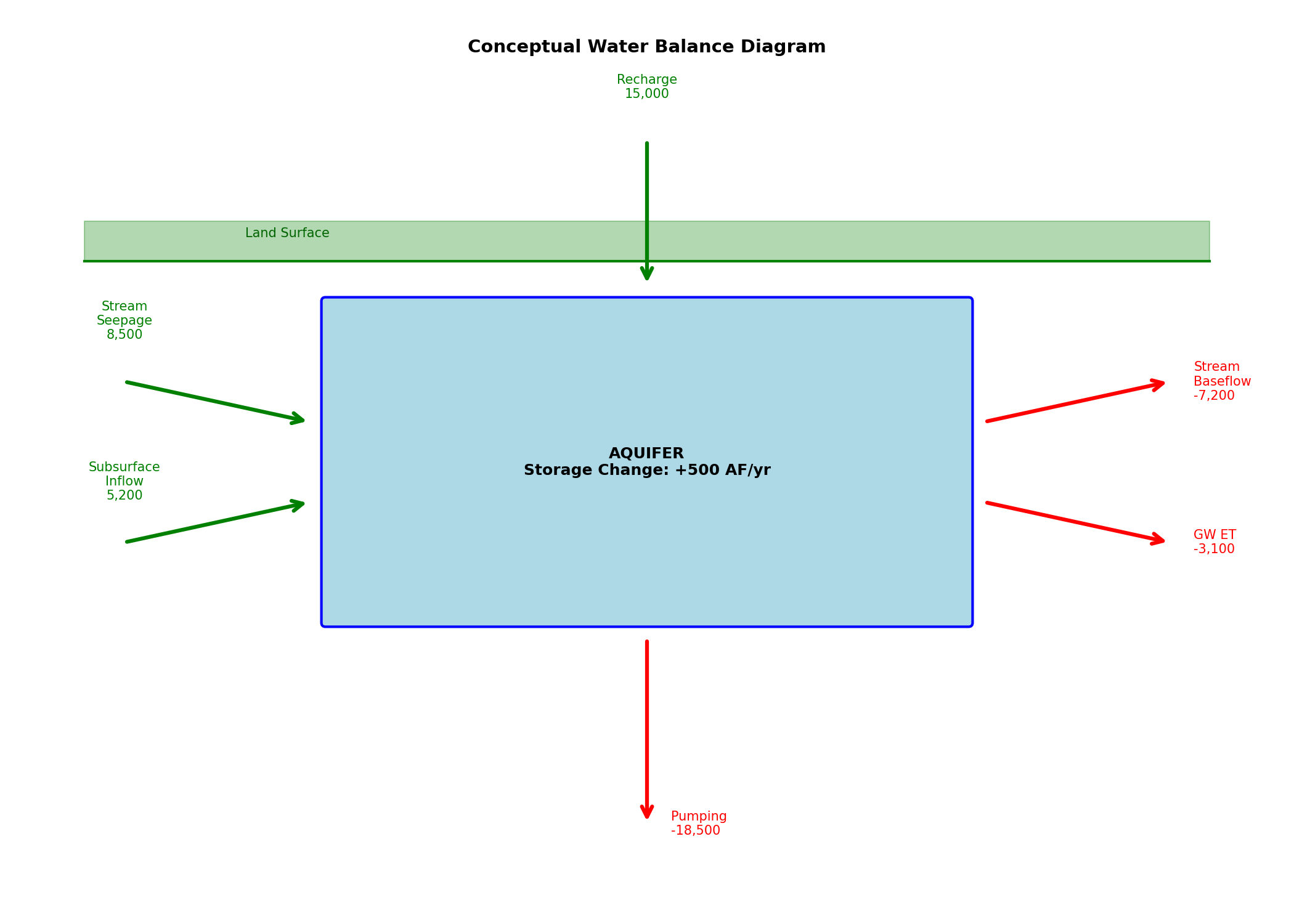
Raw matplotlib conceptual diagram for full visual control:
import matplotlib.pyplot as plt
from matplotlib.patches import FancyBboxPatch, FancyArrowPatch

fig, ax = plt.subplots(figsize=(14, 10))

aquifer = FancyBboxPatch((3, 2), 8, 4, boxstyle="round,pad=0.05",
                         facecolor='lightblue', edgecolor='blue', linewidth=2)
ax.add_patch(aquifer)
ax.text(7, 4, 'AQUIFER\nStorage Change: +500 AF/yr', ha='center', va='center',
        fontsize=12, fontweight='bold')

inflows = [
    ('Recharge\n15,000', (7, 8), (7, 6.2)),
    ('Stream\nSeepage\n8,500', (0.5, 5), (2.8, 4.5)),
    ('Subsurface\nInflow\n5,200', (0.5, 3), (2.8, 3.5)),
]
for label, start, end in inflows:
    arrow = FancyArrowPatch(start, end, arrowstyle='->', mutation_scale=20,
                            color='green', linewidth=3)
    ax.add_patch(arrow)
    ax.text(start[0], start[1] + 0.5, label, ha='center', va='bottom',
            fontsize=10, color='green')

outflows = [
    ('Pumping\n-18,500', (7, 1.8), (7, -0.5)),
    ('Stream\nBaseflow\n-7,200', (11.2, 4.5), (13.5, 5)),
    ('GW ET\n-3,100', (11.2, 3.5), (13.5, 3)),
]
for label, start, end in outflows:
    arrow = FancyArrowPatch(start, end, arrowstyle='->', mutation_scale=20,
                            color='red', linewidth=3)
    ax.add_patch(arrow)
    ax.text(end[0] + 0.3, end[1], label, ha='left', va='center',
            fontsize=10, color='red')

ax.plot([0, 14], [6.5, 6.5], 'g-', linewidth=2)
ax.fill_between([0, 14], [6.5, 6.5], [7, 7], color='green', alpha=0.3)
ax.text(2, 6.8, 'Land Surface', fontsize=10, color='darkgreen')

ax.set_xlim(-1, 15)
ax.set_ylim(-1, 9)
ax.set_aspect('equal')
ax.axis('off')
ax.set_title('Conceptual Water Balance Diagram', fontsize=14, fontweight='bold')
plt.show()
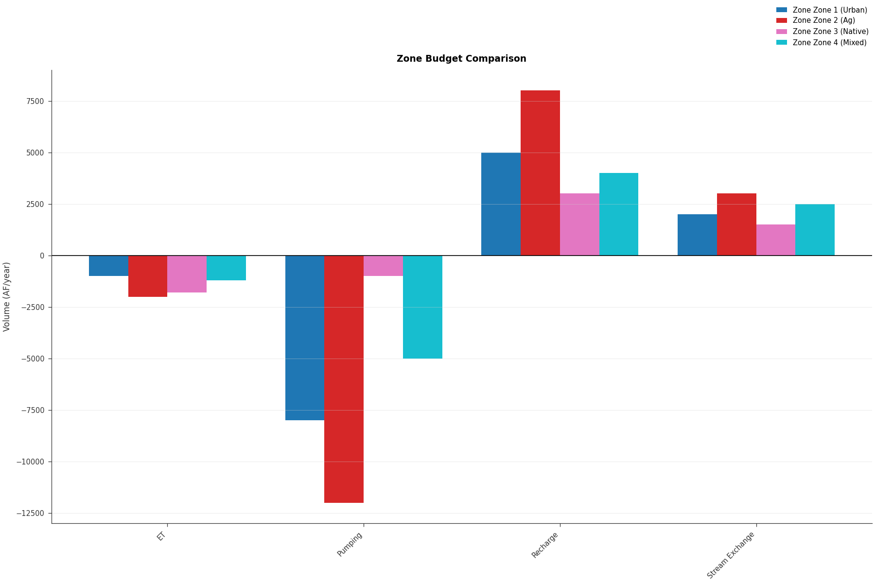
Zone Budget Comparison#
Use plot_zbudget() for zone-based budgets:
import matplotlib.pyplot as plt
from pyiwfm.visualization.plotting import plot_zbudget

zone_budgets = {
    'Zone 1 (Urban)': {
        'Recharge': 5000, 'Pumping': -8000, 'Stream Exchange': 2000, 'ET': -1000
    },
    'Zone 2 (Ag)': {
        'Recharge': 8000, 'Pumping': -12000, 'Stream Exchange': 3000, 'ET': -2000
    },
    'Zone 3 (Native)': {
        'Recharge': 3000, 'Pumping': -1000, 'Stream Exchange': 1500, 'ET': -1800
    },
    'Zone 4 (Mixed)': {
        'Recharge': 4000, 'Pumping': -5000, 'Stream Exchange': 2500, 'ET': -1200
    },
}

fig, ax = plot_zbudget(zone_budgets, title='Zone Budget Comparison',
                        plot_type='bar', units='AF/year')
plt.show()
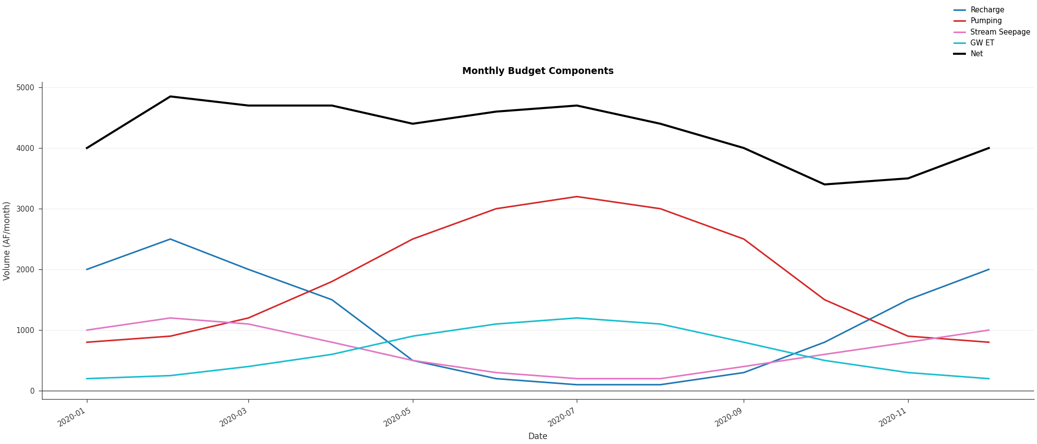
Monthly Budget Pattern#
Use plot_budget_timeseries() for seasonal patterns:
import matplotlib.pyplot as plt
import numpy as np
from pyiwfm.visualization.plotting import plot_budget_timeseries

# Monthly data for one year
times = np.array([f'2020-{m:02d}-01' for m in range(1, 13)], dtype='datetime64')

budgets = {
    'Recharge': np.array([2000, 2500, 2000, 1500, 500, 200, 100, 100, 300, 800, 1500, 2000],
                         dtype=float),
    'Pumping': np.array([800, 900, 1200, 1800, 2500, 3000, 3200, 3000, 2500, 1500, 900, 800],
                        dtype=float),
    'Stream Seepage': np.array([1000, 1200, 1100, 800, 500, 300, 200, 200, 400, 600, 800, 1000],
                               dtype=float),
    'GW ET': np.array([200, 250, 400, 600, 900, 1100, 1200, 1100, 800, 500, 300, 200],
                      dtype=float),
}

fig, ax = plot_budget_timeseries(times, budgets,
                                  title='Monthly Budget Components',
                                  units='AF/month')
plt.show()
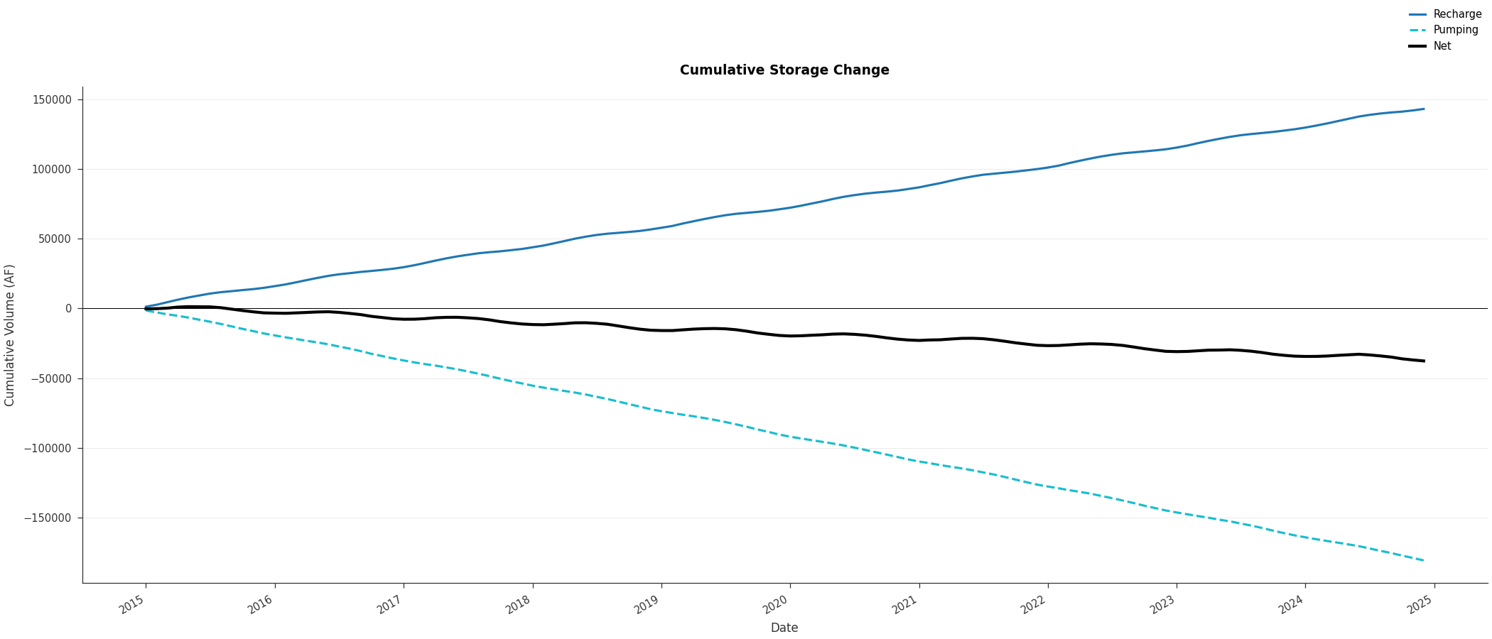
Cumulative Budget#
Show cumulative storage change using plot_budget_timeseries with cumulative=True:
import matplotlib.pyplot as plt
import numpy as np
from pyiwfm.visualization.plotting import plot_budget_timeseries

np.random.seed(42)
n_months = 120
times = np.arange('2015-01', '2025-01', dtype='datetime64[M]')

t = np.arange(n_months)
recharge = 1200 + 500 * np.sin(2 * np.pi * t / 12) + np.random.normal(0, 100, n_months)
pumping = 1500 + 300 * np.sin(2 * np.pi * (t + 6) / 12) + np.random.normal(0, 80, n_months)

budgets = {'Recharge': recharge, 'Pumping': -pumping}

fig, ax = plot_budget_timeseries(times, budgets, cumulative=True,
                                  title='Cumulative Storage Change',
                                  units='AF')
plt.show()
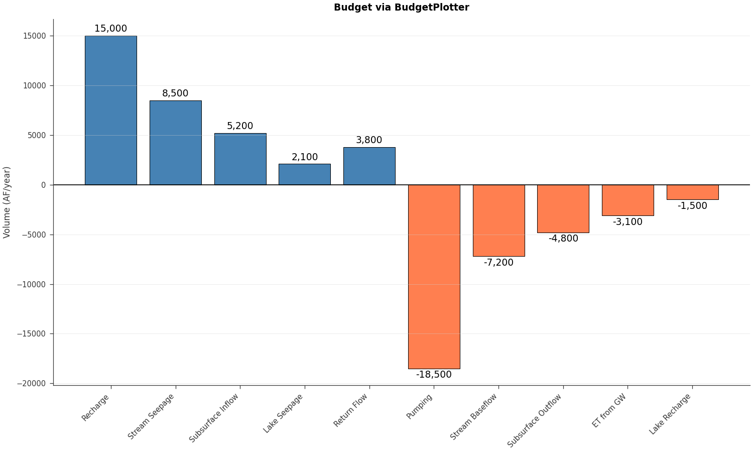
BudgetPlotter Class#
Use the BudgetPlotter class for an
object-oriented workflow:
import matplotlib.pyplot as plt
from pyiwfm.sample_models import create_sample_budget_data
from pyiwfm.visualization.plotting import BudgetPlotter

budget = create_sample_budget_data()

# Combine all components
components = {}
for name, val in budget['Inflows'].items():
    components[name] = val
for name, val in budget['Outflows'].items():
    components[name] = val

plotter = BudgetPlotter(budgets=components, units='AF/year')

fig, ax = plotter.bar_chart(title='Budget via BudgetPlotter')
plt.show()