Drawdown Maps#
Visualize groundwater drawdown using diverging colormaps that highlight areas of water level decline and recovery.
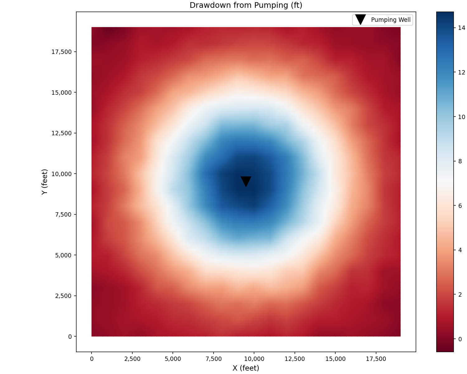
Synthetic Drawdown Cone#
Generate a synthetic pumping-induced drawdown and display with a diverging color scale:
import matplotlib.pyplot as plt
import numpy as np
from pyiwfm.sample_models import create_sample_mesh, create_sample_scalar_field
from pyiwfm.visualization.plotting import plot_scalar_field

mesh = create_sample_mesh(nx=20, ny=20, n_subregions=4)
drawdown = create_sample_scalar_field(mesh, field_type='drawdown')

# Center the colormap around zero
vmax = max(abs(drawdown.min()), abs(drawdown.max()))

fig, ax = plot_scalar_field(mesh, drawdown, cmap='RdBu',
                            show_mesh=False)
ax.set_title('Drawdown from Pumping (ft)')
ax.set_xlabel('X (feet)')
ax.set_ylabel('Y (feet)')

# Mark pumping well
x_c = 0.5 * max(n.x for n in mesh.nodes.values())
y_c = 0.5 * max(n.y for n in mesh.nodes.values())
ax.plot(x_c, y_c, 'kv', markersize=15, label='Pumping Well')
ax.legend()
plt.show()
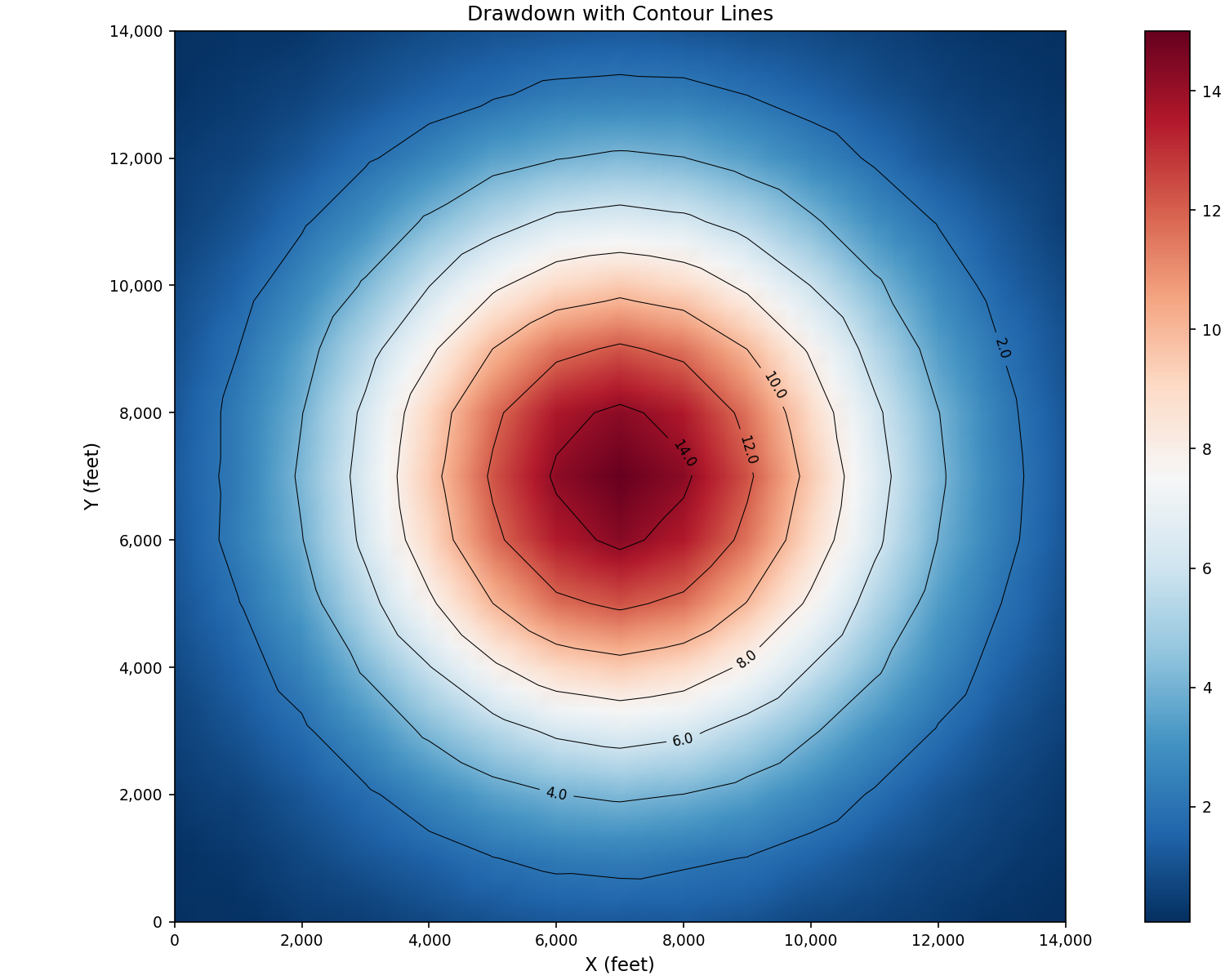
Drawdown with Contours#
Combine filled drawdown with contour lines:
import matplotlib.pyplot as plt
import numpy as np
from matplotlib.tri import Triangulation
from pyiwfm.sample_models import create_sample_mesh, create_sample_scalar_field
from pyiwfm.visualization.plotting import plot_scalar_field

mesh = create_sample_mesh(nx=15, ny=15, n_subregions=4)
drawdown = create_sample_scalar_field(mesh, field_type='drawdown', noise_level=0.01)

x = np.array([n.x for n in mesh.nodes.values()])
y = np.array([n.y for n in mesh.nodes.values()])

fig, ax = plot_scalar_field(mesh, drawdown, cmap='RdBu_r', show_mesh=False)

tri = Triangulation(x, y)
cs = ax.tricontour(tri, drawdown, levels=8, colors='black', linewidths=0.5)
ax.clabel(cs, inline=True, fontsize=8, fmt='%.1f')

ax.set_title('Drawdown with Contour Lines')
ax.set_xlabel('X (feet)')
ax.set_ylabel('Y (feet)')
plt.show()
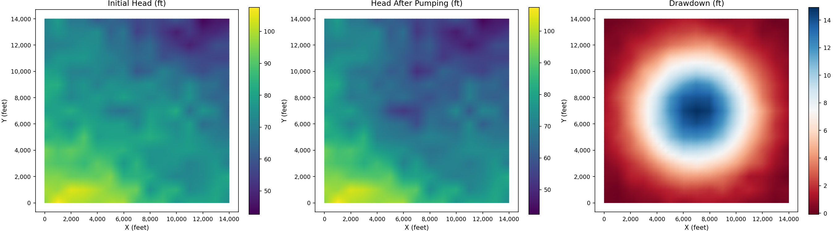
Before vs After Comparison#
Side-by-side comparison of head distribution before and after pumping:
import matplotlib.pyplot as plt
import numpy as np
from pyiwfm.sample_models import create_sample_mesh, create_sample_scalar_field
from pyiwfm.visualization.plotting import plot_scalar_field

mesh = create_sample_mesh(nx=15, ny=15, n_subregions=4)
head_before = create_sample_scalar_field(mesh, field_type='head')
drawdown = create_sample_scalar_field(mesh, field_type='drawdown')
head_after = head_before - np.abs(drawdown)

fig, axes = plt.subplots(1, 3, figsize=(18, 5))

plot_scalar_field(mesh, head_before, ax=axes[0], cmap='viridis', show_mesh=False)
axes[0].set_title('Initial Head (ft)')

plot_scalar_field(mesh, head_after, ax=axes[1], cmap='viridis', show_mesh=False)
axes[1].set_title('Head After Pumping (ft)')

plot_scalar_field(mesh, drawdown, ax=axes[2], cmap='RdBu', show_mesh=False)
axes[2].set_title('Drawdown (ft)')

for ax in axes:
    ax.set_xlabel('X (feet)')
    ax.set_ylabel('Y (feet)')

plt.show()