Scalar Field Visualization#
This page demonstrates how to visualize scalar fields on IWFM meshes, such as hydraulic head, drawdown, recharge, and other spatially-varying quantities.
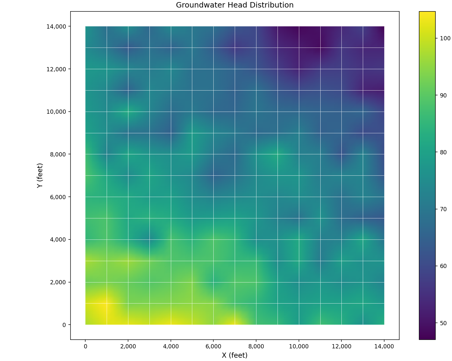
Hydraulic Head Distribution#
The most common scalar field in groundwater modeling is hydraulic head:
import matplotlib.pyplot as plt
from pyiwfm.sample_models import create_sample_mesh, create_sample_scalar_field
from pyiwfm.visualization.plotting import plot_scalar_field

# Create mesh and head data
mesh = create_sample_mesh(nx=15, ny=15, n_subregions=4)
head = create_sample_scalar_field(mesh, field_type='head')

fig, ax = plot_scalar_field(mesh, head, cmap='viridis',
                            show_mesh=True, edge_color='white')
ax.set_title('Groundwater Head Distribution')
ax.set_xlabel('X (feet)')
ax.set_ylabel('Y (feet)')
plt.show()
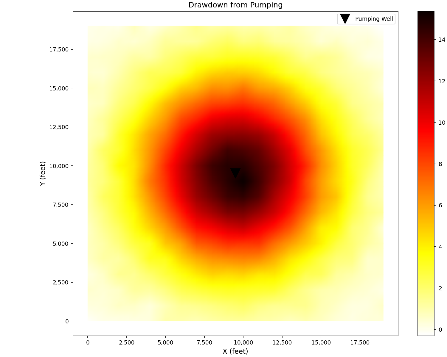
Drawdown Cone#
Visualize pumping-induced drawdown showing characteristic cone of depression:
import matplotlib.pyplot as plt
from pyiwfm.sample_models import create_sample_mesh, create_sample_scalar_field
from pyiwfm.visualization.plotting import plot_scalar_field

mesh = create_sample_mesh(nx=20, ny=20, n_subregions=4)
drawdown = create_sample_scalar_field(mesh, field_type='drawdown')

fig, ax = plot_scalar_field(mesh, drawdown, cmap='hot_r', show_mesh=False)

# Mark pumping well location
x_center = 0.5 * max(n.x for n in mesh.nodes.values())
y_center = 0.5 * max(n.y for n in mesh.nodes.values())
ax.plot(x_center, y_center, 'kv', markersize=15, label='Pumping Well')
ax.legend()
ax.set_title('Drawdown from Pumping')
ax.set_xlabel('X (feet)')
ax.set_ylabel('Y (feet)')
plt.show()
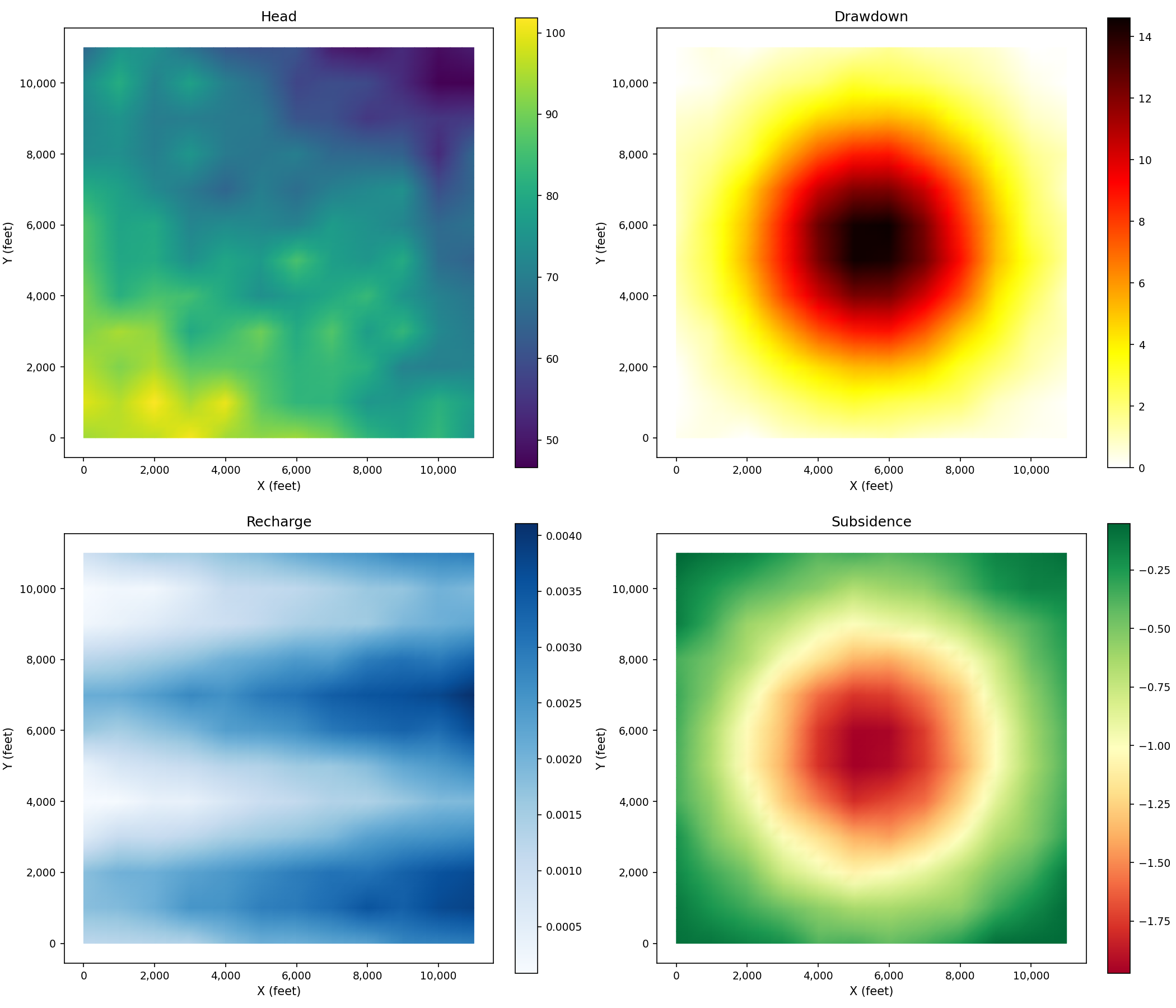
Multiple Fields Comparison#
Compare different scalar fields side by side:
import matplotlib.pyplot as plt
from pyiwfm.sample_models import create_sample_mesh, create_sample_scalar_field
from pyiwfm.visualization.plotting import plot_scalar_field

mesh = create_sample_mesh(nx=12, ny=12, n_subregions=4)

# Generate different fields
fields = {
    'Head (ft)': ('head', 'viridis'),
    'Drawdown (ft)': ('drawdown', 'hot_r'),
    'Recharge (ft/day)': ('recharge', 'Blues'),
    'Subsidence (ft)': ('subsidence', 'RdYlGn'),
}

fig, axes = plt.subplots(2, 2, figsize=(14, 12))
axes = axes.flatten()

for ax, (label, (field_type, cmap)) in zip(axes, fields.items()):
    data = create_sample_scalar_field(mesh, field_type=field_type)
    plot_scalar_field(mesh, data, ax=ax, cmap=cmap, show_mesh=False)
    ax.set_title(label.split('(')[0].strip())
    ax.set_xlabel('X (feet)')
    ax.set_ylabel('Y (feet)')

plt.show()
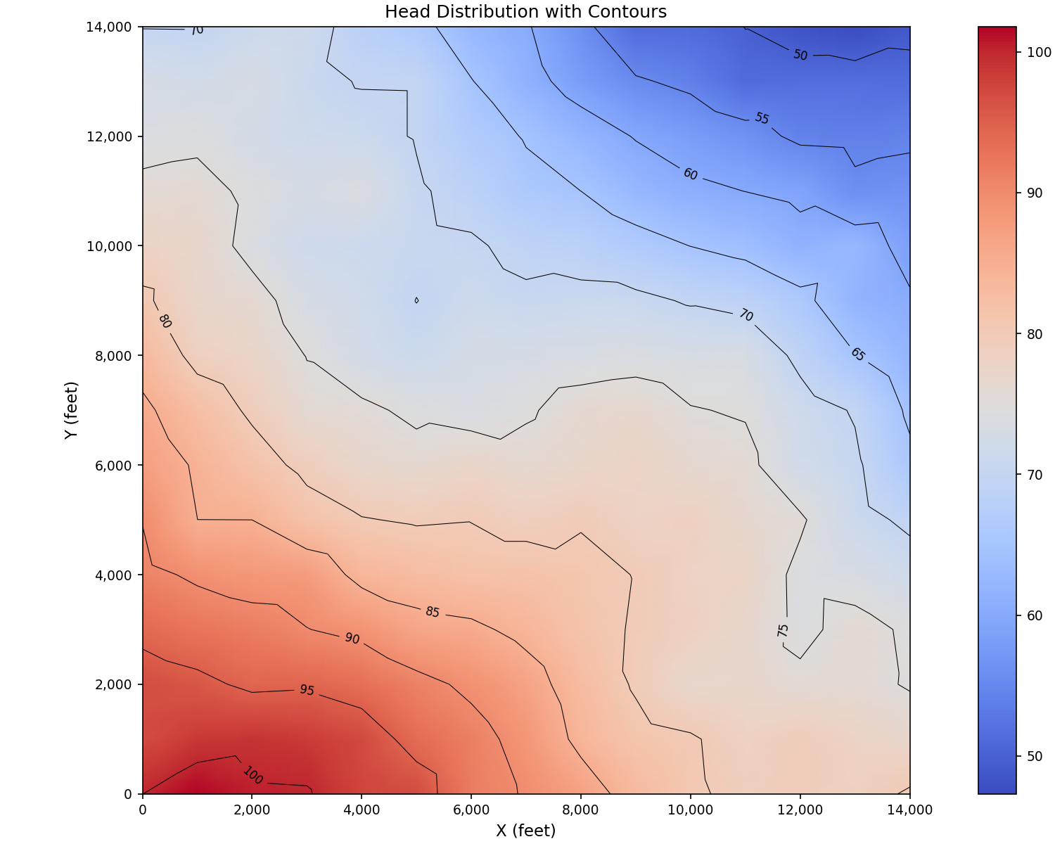
Contour Lines#
Add contour lines to scalar field visualizations:
import matplotlib.pyplot as plt
import numpy as np
from matplotlib.tri import Triangulation
from pyiwfm.sample_models import create_sample_mesh, create_sample_scalar_field
from pyiwfm.visualization.plotting import plot_scalar_field

mesh = create_sample_mesh(nx=15, ny=15, n_subregions=4)
head = create_sample_scalar_field(mesh, field_type='head', noise_level=0.01)

# Extract coordinates and values
x = np.array([n.x for n in mesh.nodes.values()])
y = np.array([n.y for n in mesh.nodes.values()])

fig, ax = plot_scalar_field(mesh, head, cmap='coolwarm', show_mesh=False)

# Add contour lines using triangulation
tri = Triangulation(x, y)
cs = ax.tricontour(tri, head, levels=10, colors='black', linewidths=0.5)
ax.clabel(cs, inline=True, fontsize=8, fmt='%.0f')

ax.set_title('Head Distribution with Contours')
ax.set_xlabel('X (feet)')
ax.set_ylabel('Y (feet)')
plt.show()
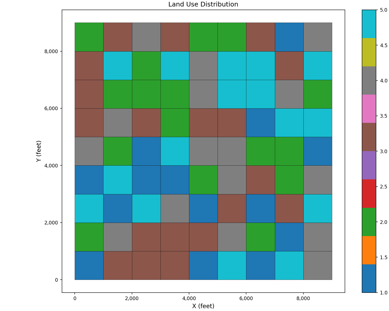
Element-Centered Data#
Use plot_scalar_field() with
field_type='cell' for element-centered data like land use or soil type:
import matplotlib.pyplot as plt
from pyiwfm.sample_models import create_sample_mesh, create_sample_element_field
from pyiwfm.visualization.plotting import plot_scalar_field

mesh = create_sample_mesh(nx=10, ny=10, n_subregions=4)
land_use = create_sample_element_field(mesh, field_type='land_use')

fig, ax = plot_scalar_field(mesh, land_use, field_type='cell',
                            cmap='tab10', show_mesh=True,
                            edge_color='black', edge_width=0.3)
ax.set_title('Land Use Distribution')
ax.set_xlabel('X (feet)')
ax.set_ylabel('Y (feet)')
plt.show()
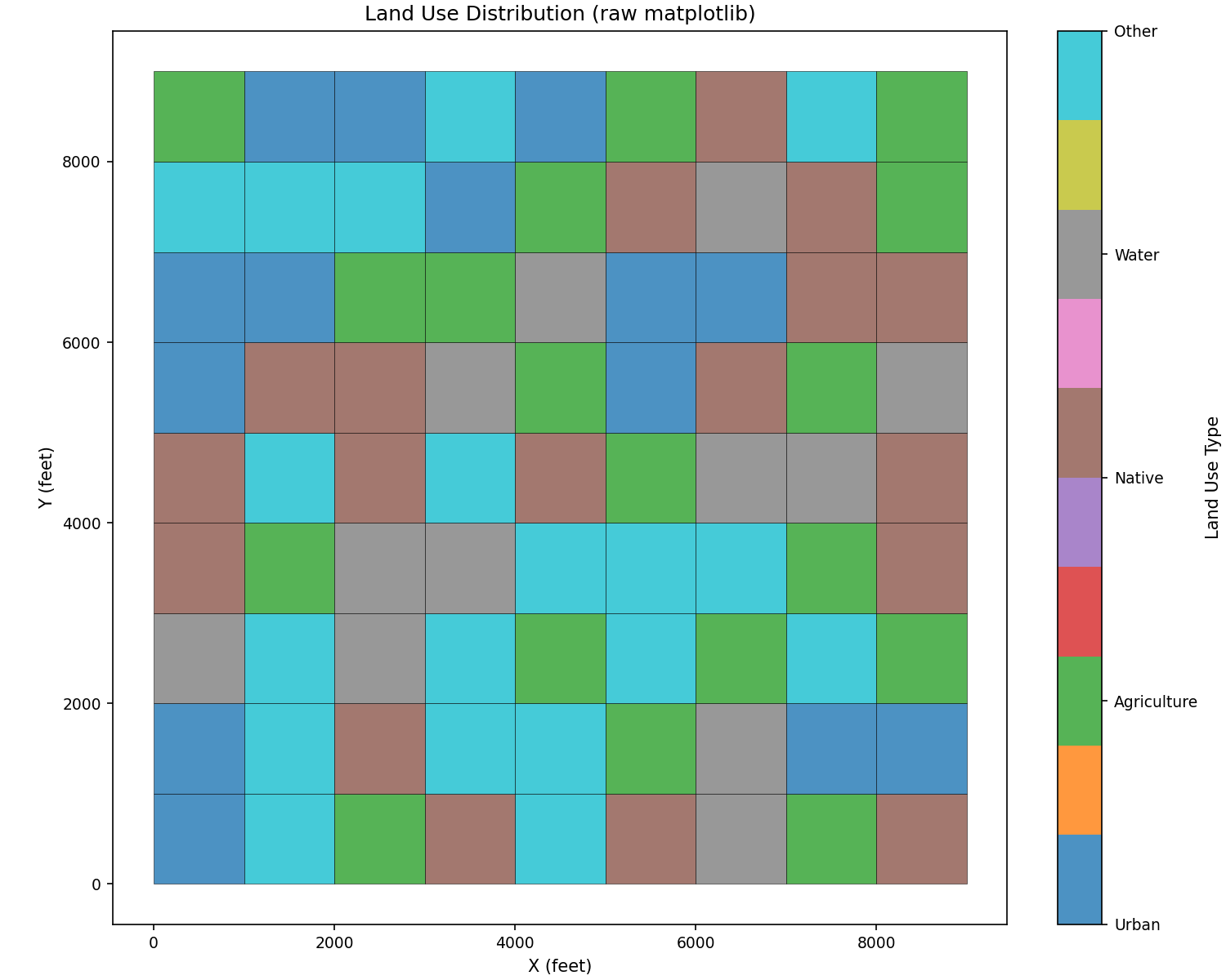
Raw matplotlib alternative with custom category labels:
import matplotlib.pyplot as plt
from matplotlib.patches import Polygon
from matplotlib.collections import PatchCollection
import numpy as np
from pyiwfm.sample_models import create_sample_mesh, create_sample_element_field

mesh = create_sample_mesh(nx=10, ny=10, n_subregions=4)
land_use = create_sample_element_field(mesh, field_type='land_use')

fig, ax = plt.subplots(figsize=(10, 8))

patches = []
for elem in mesh.elements.values():
    verts = [(mesh.nodes[v].x, mesh.nodes[v].y) for v in elem.vertices]
    patches.append(Polygon(verts))

p = PatchCollection(patches, alpha=0.8, edgecolor='black', linewidth=0.3)
p.set_array(land_use)
p.set_cmap('tab10')
ax.add_collection(p)

ax.autoscale()
ax.set_aspect('equal')

cbar = plt.colorbar(p, ax=ax, ticks=[1, 2, 3, 4, 5])
cbar.set_label('Land Use Type')
cbar.ax.set_yticklabels(['Urban', 'Agriculture', 'Native', 'Water', 'Other'])

ax.set_title('Land Use Distribution (raw matplotlib)')
ax.set_xlabel('X (feet)')
ax.set_ylabel('Y (feet)')
plt.show()